

Case studies / Business websites
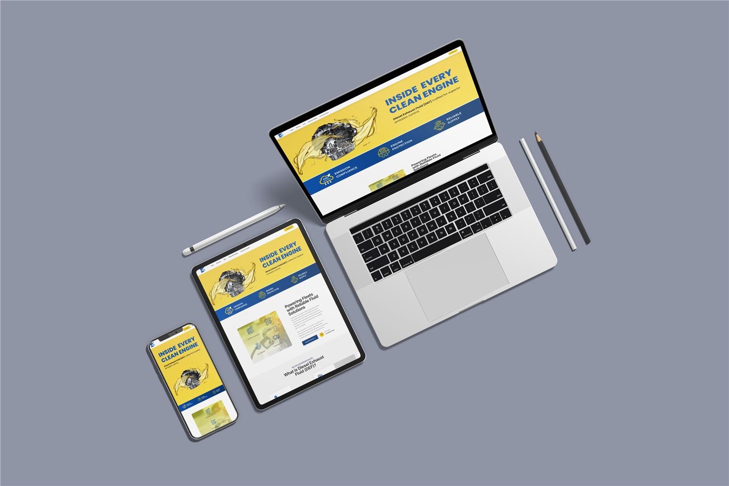
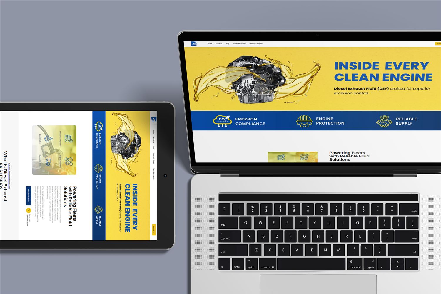
One design that holds up on every screen
Sites designed phone-first, then scaled up, so the experience is right where most visitors actually are.
The brief
Organisations needed websites that look credible, load quickly and turn visits into conversations, on a phone first and a desktop second.
Our approach
We design the smallest screen first, decide what matters most, and then let the layout open up for larger devices.
Every build is checked for speed, accessibility and search readiness before launch, not after.
What we delivered
- Mobile-first interface design
- Responsive build
- Search-ready page structure
- Performance and accessibility checks
The outcome
Fast, clear websites that behave the same way on a phone, a tablet and a desktop.